Covid-19 Spread and Mortality in the United States
Covid-19 data from Johns Hopkins University was used to create several visualizations of the geographic distribution of cases and deaths over time.
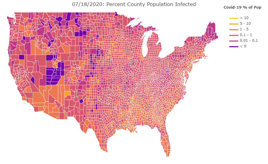
First, the number of cases and deaths was studied by state. Animations called bar chart races were created to show the relative number of cases and deaths by state over time. Next, population data was added to the dataset and the per-capita number of cases and deaths was calculated for each location and date. Finally, the data was geographically mapped by county with a colorscheme representing the per capita number or cases and per capita number of deaths for each county.
Per Capita data captures the progression of viral contagion within a given community and can better allow communities to prepare mitigation effort.